

The challenge
What we delivered
From a gallery of renders to an instrument that sells
Elevate Vision is an Israeli studio that builds photorealistic visualizations, films and interactive tours for high-end real estate. Developers come to them when a project has to be sold before the first floor is poured.
The task was not a portfolio. It was to give the studio a site that works the way their own product works - cinematic, immersive, and usable as a sales instrument in front of a buyer.
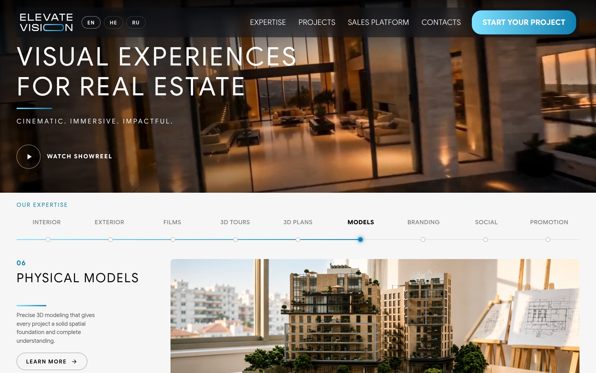
The first screen is a film, not a picture. Aerial footage plays behind the headline, and the only call to action is the showreel.
Approach and architecture
The old site was a gallery. It showed renders well and explained nothing - a visitor could admire the work without ever understanding what could be ordered, at what stage, or in what form. For a studio selling to developers, that is a lost conversation.
The new structure answers three questions in order: what you get, who has already got it, and how it happens. Expertise, projects, process. Each is built as an interaction rather than a block of text, because the studio sells exactly that - the experience of looking at something that has not been built yet.
Nine services in one line
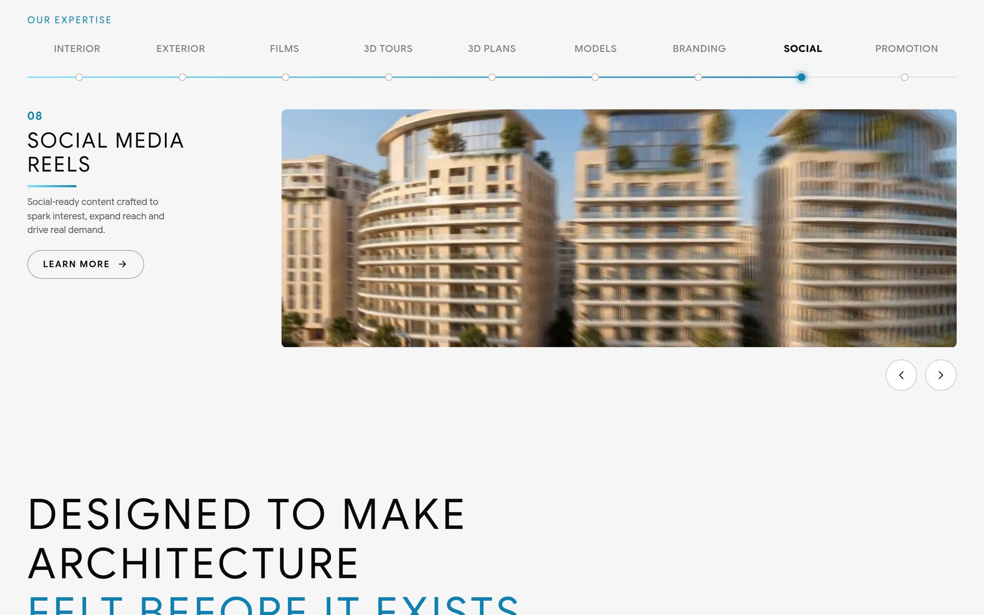
Interiors, exteriors, films, 3D tours, floor plans, physical models, branding, social content, promotion. Nine directions that would normally become nine menu items and a wall of cards.
Instead they became a single stepper. The visitor moves along it as along a timeline, each step opening its own example, and every direction still keeps a full page of its own for search traffic and for a direct link in a proposal.
Projects carry the page
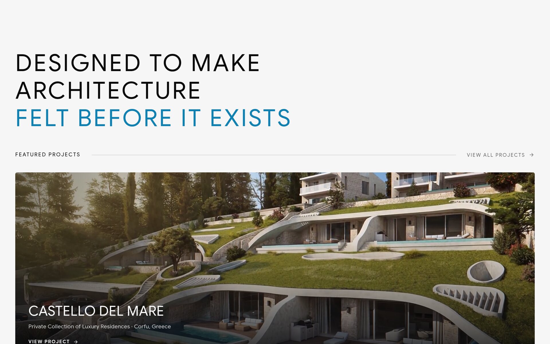
The project grid deliberately breaks its own rhythm: wide cards alternate with pairs, so scrolling never turns into a catalogue. Each project has a name, a type and a geography - Corfu, Jerusalem, Beit Shemesh - and its own page behind it.
The process is shown, not described
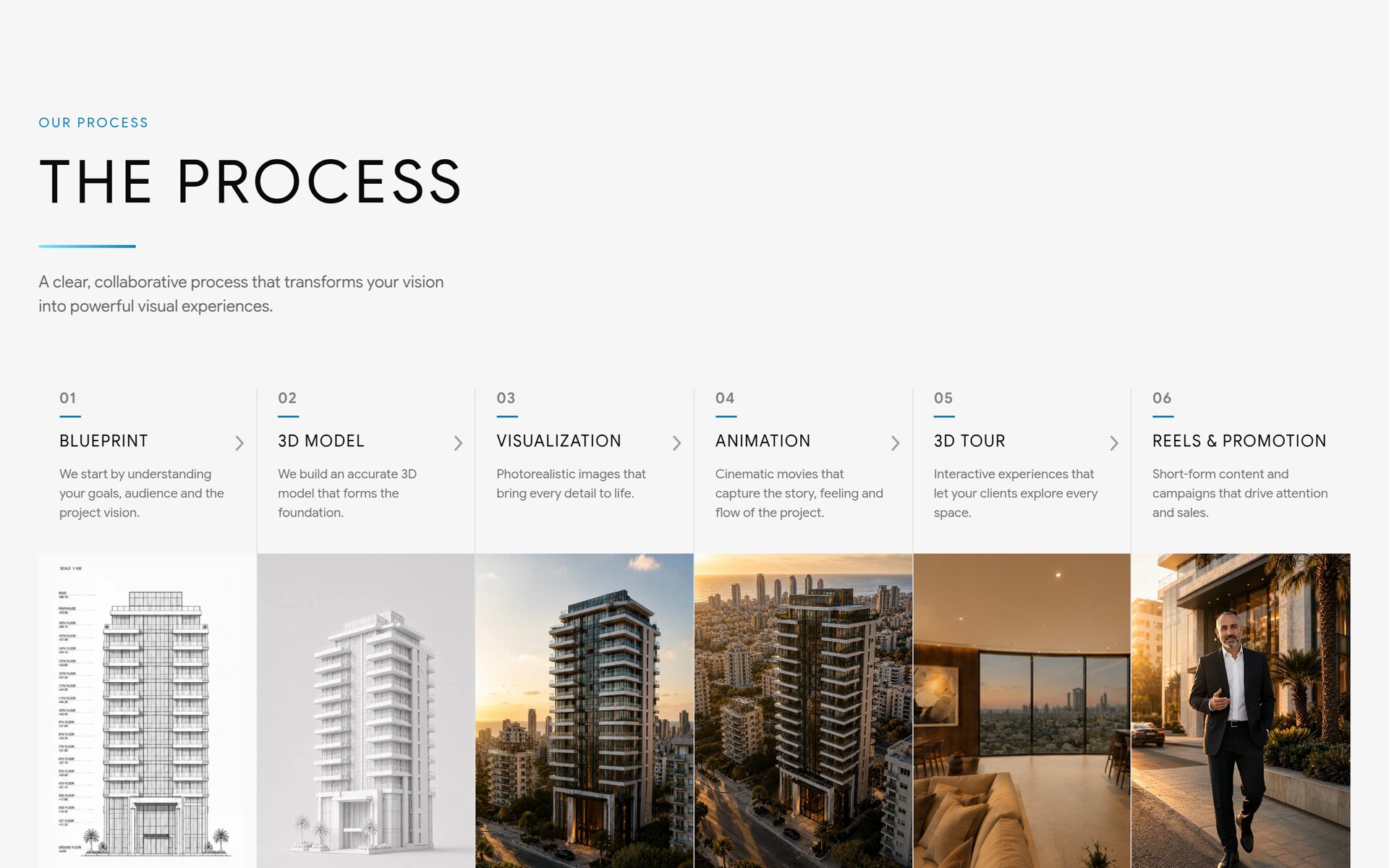
Six steps from brief to promotion: blueprint, 3D model, visualization, animation, 3D tour, reels. The point of the block is not the list - it is the fifth step, where an interactive tour is built into the page itself. “Drag to explore” is not a caption but an instruction: the visitor turns the camera inside a finished interior without leaving the home page.
AI characters
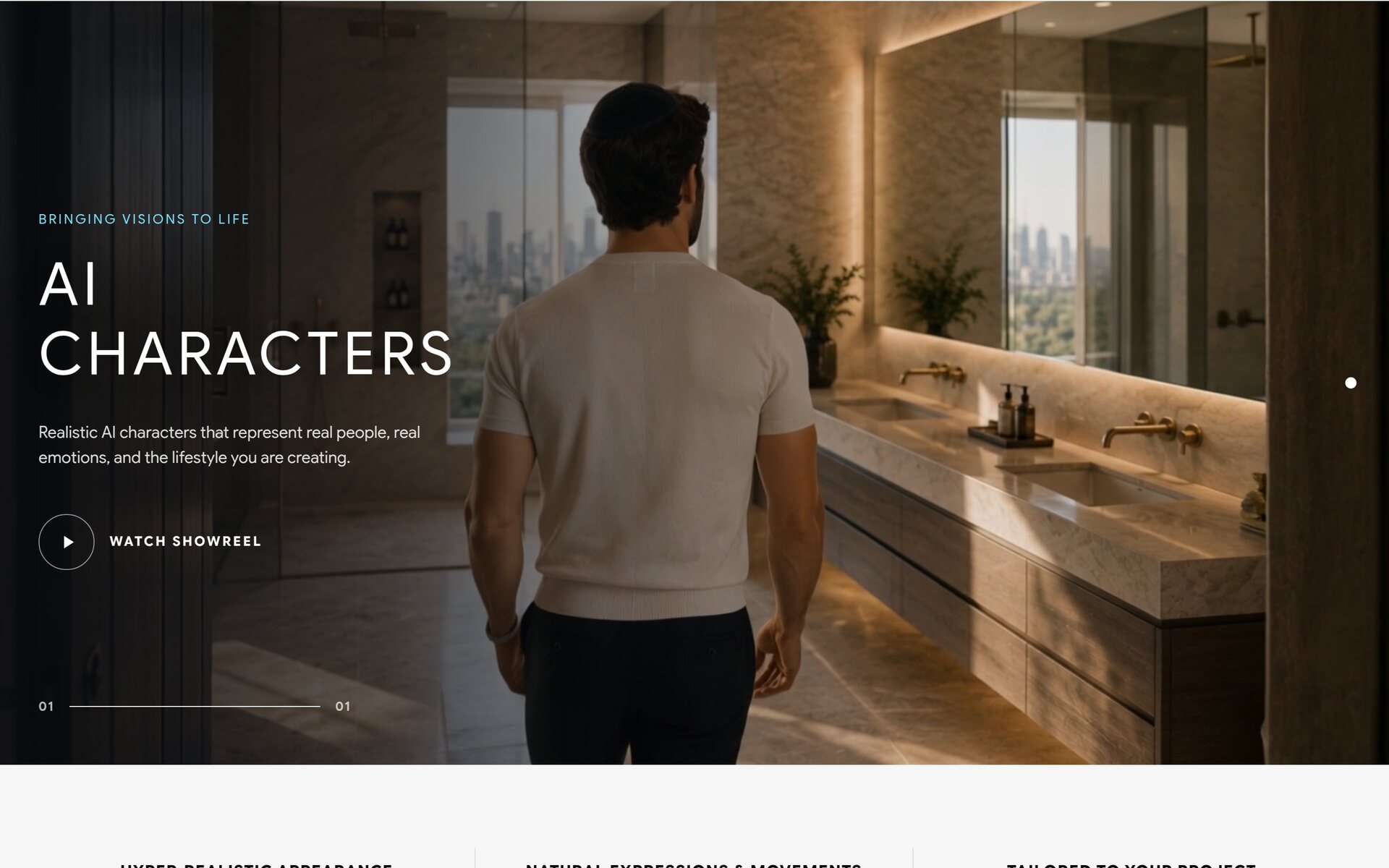
A separate section for something the studio had nowhere to put before: photoreal people inside renders. Not silhouettes for scale, but characters with expressions and movement, matched to the audience a developer is selling to.
The sales platform as a product
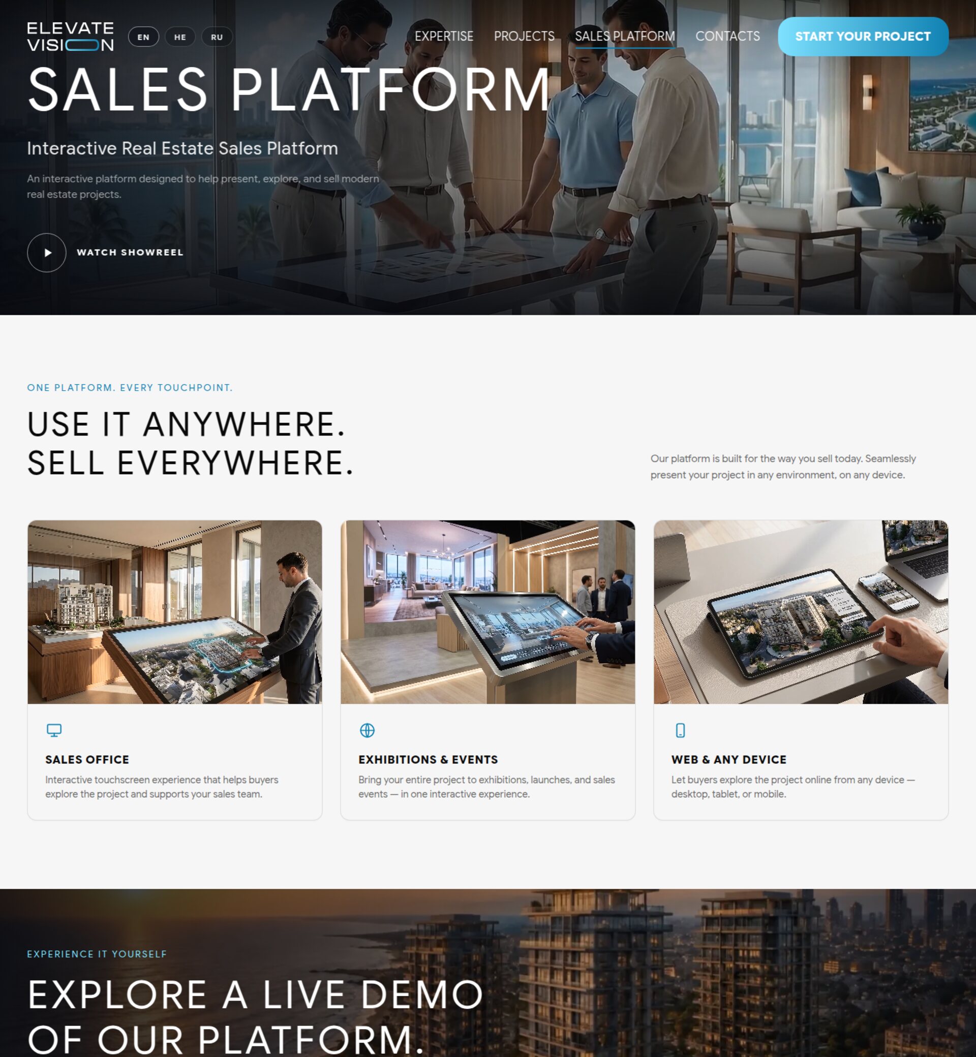
The most important part of the rework. The studio had an interactive presentation system for real estate - a touchscreen table in a sales office, a stand at an exhibition, the same project openable from a phone. On the old site it did not exist at all.
It now has its own section with its own hero, its own showreel and a live demo: three usage scenarios - sales office, exhibitions, any device - and a link to try the thing rather than read about it.
Three languages and a full mirror for Hebrew
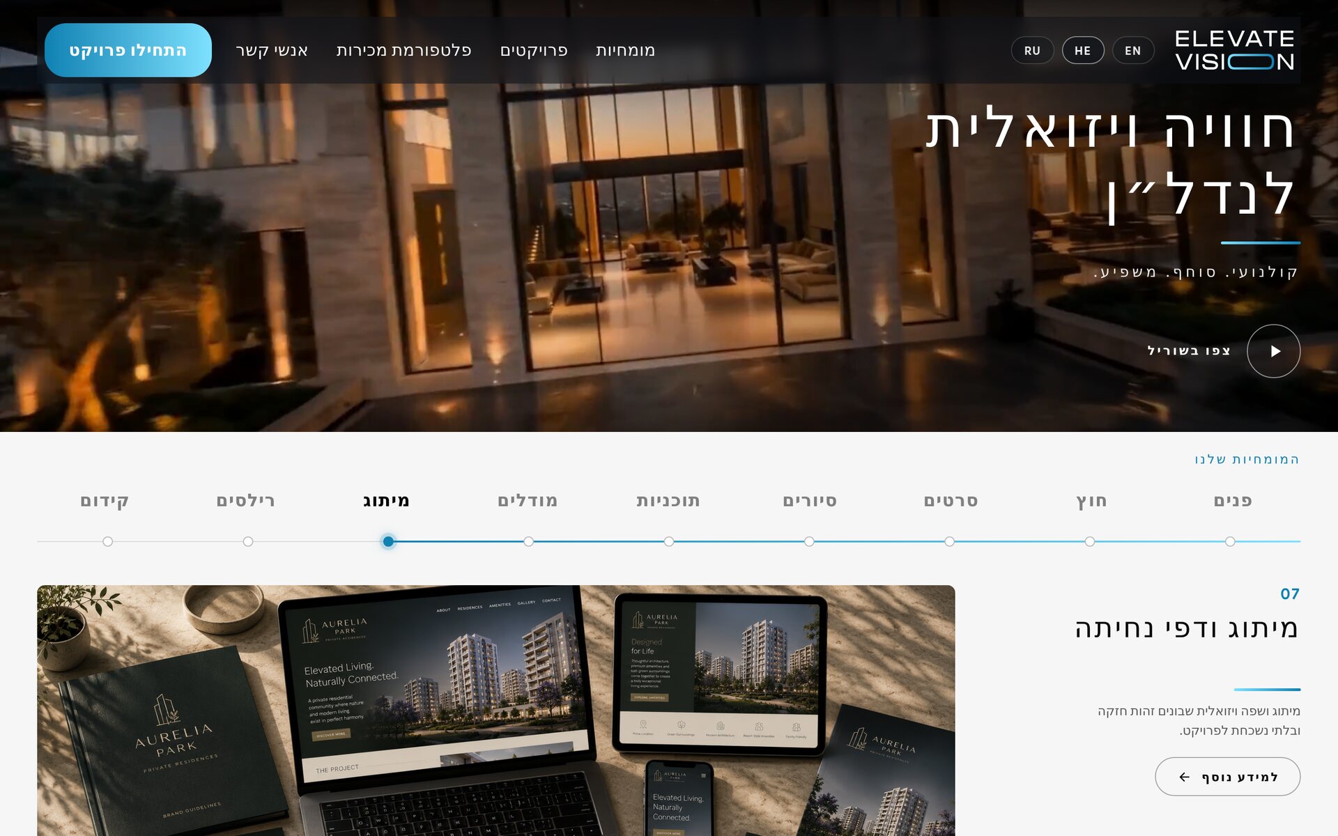
English became the main language - the studio works with international developers. Hebrew and Russian sit alongside it, and Hebrew is not a translation layer but a complete mirror: the logo moves to the right, navigation reverses, the expertise stepper runs the other way, and every block flips with it.
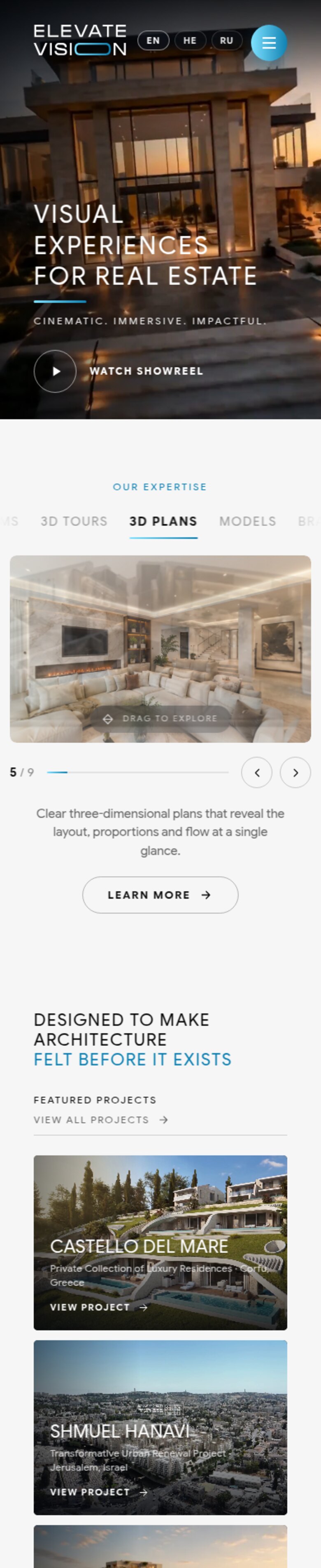
The same choreography holds on a phone: the video hero, the stepper and the interactive tour all keep working on a narrow screen rather than collapsing into a static fallback.
Delivery process
Technical stack
Front-end
WordPress on a bespoke theme. Video hero with a controlled preloader, Pannellum for the 360° tour, scroll-triggered animation across sections, an accordion FAQ.
Structure
Nine expertise pages and eight project pages, each addressable on its own - for search, and for sending a single link in a proposal.
Multilingual
English, Hebrew and Russian on separate URLs. Hebrew is handled as a full RTL mirror of layout, navigation and typography, not a text swap.
What changed
The studio stopped being a gallery of pictures and became a presentation of what it actually sells. A developer arriving on the site can watch a film, turn the camera inside a finished interior, see how a project is assembled step by step, and open the sales platform - without a single phone call.
English as the primary language opened the site to international developers, and the platform section turned a service the studio could previously only demonstrate in person into something anyone can find on their own.


